

The course called ’Type Design’ took my understanding of typography on a deeper level by assigning me to design a typeface myself. This was one of the thrilling school projects I’ve had and I enjoyed it very much!
Type Design -kurssi johdatti käsitykseni typografiasta entistä pidemmälle, sillä se haastoi suunnittelemaan kokonaisen fontin aivan itse. Tämä on ollut yksi jännittävimmistä kouluprojekteistani, ja nautin siitä kovasti!
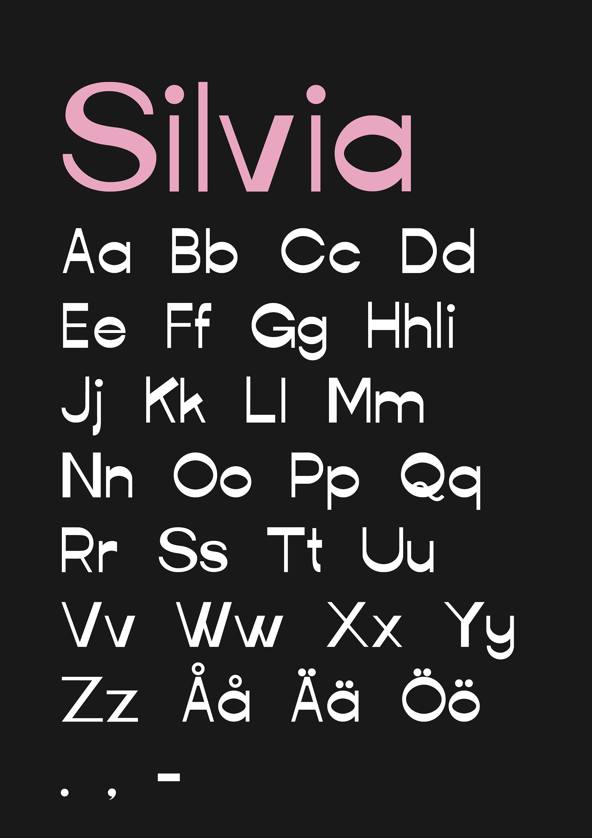
Fontin näyte / Type specimen
I wanted to create a typeface that would be clear, yet fun, but also test a bit the conventions of designing a font type. The process started with a tilted letter ’o’, and I wanted to continue this pattern of slightly changing the basic structures. The final version should give a funny feeling that somethings not right, although everything seems like it.
Halusin suunnitella tekstityypin, joka olisi selkeä mutta hauska, ja haastaisi hieman kirjainsuunnittelun konventioita. Prosessi alkoi käännetystä o-kirjaimesta, ja halusin jatkaa tätä kaavaa muuttamalla jokaisen kirjaimen perusrakenteita. Lopullisen version tulisi siis antaa katsojalleen hassun tunteen siitä, että kaikki ei ole aivan kohdillaan vaikka siltä kuitenkin näyttää.

Esimerkki fontin käytöstä / Example of using the typeface
The name of the typeface, Silvia (as the Queen of Sweden), is the one that my grandma would have wanted me to have. Therefore, I decided to give it a chance as the name of the first typeface designed by me.The design process still continues, but the version presented here is quite close to be ready.
Tekstityypin nimi, Silvia (kuten Ruotsin kuningatar), on nimi jonka mummoni olisi halunnut minulle. Toisin kävi, mutta siksipä päätin antaa sille mahdollisuuden olla ensimmäisen suunnittelemani fontin nimi. Suunnitteluprosessi jatkuu edelleen, mutta tässä esitetty versio on jo aika lähellä valmista.